Cherry
BRANDING – LOGO CREATION – GUIDELINES – UI
Development of a visual identity for a fictional brand as part of a case study. Cherry is a competitor and parody of Apple, with a sales strategy focused on high-end products, approachable communication, and premium benefits.
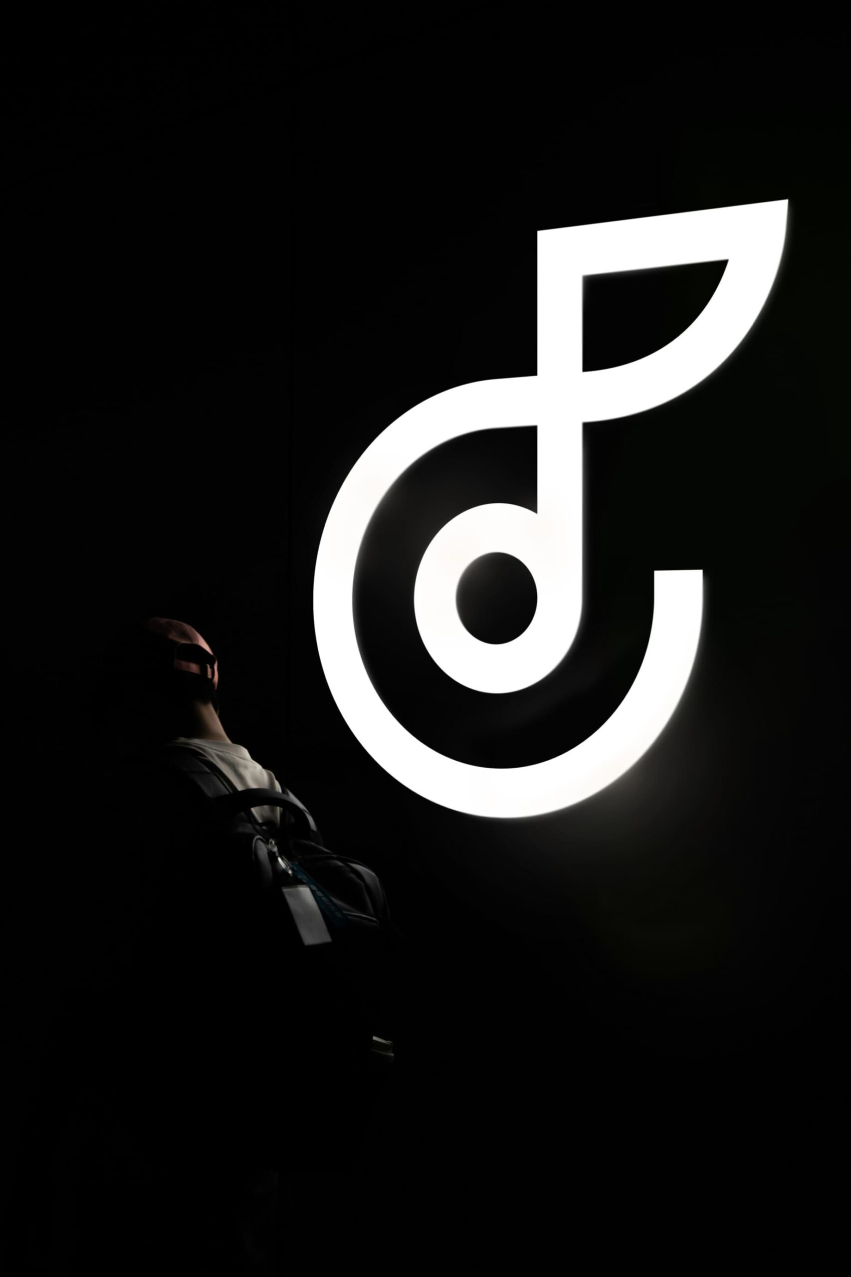

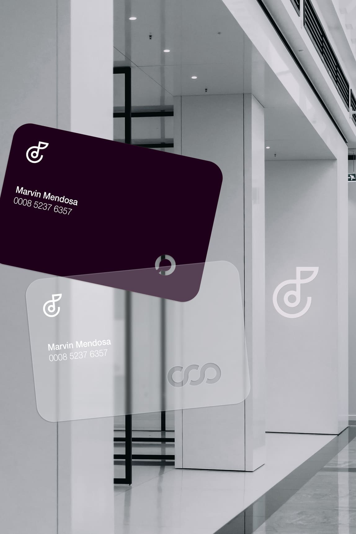
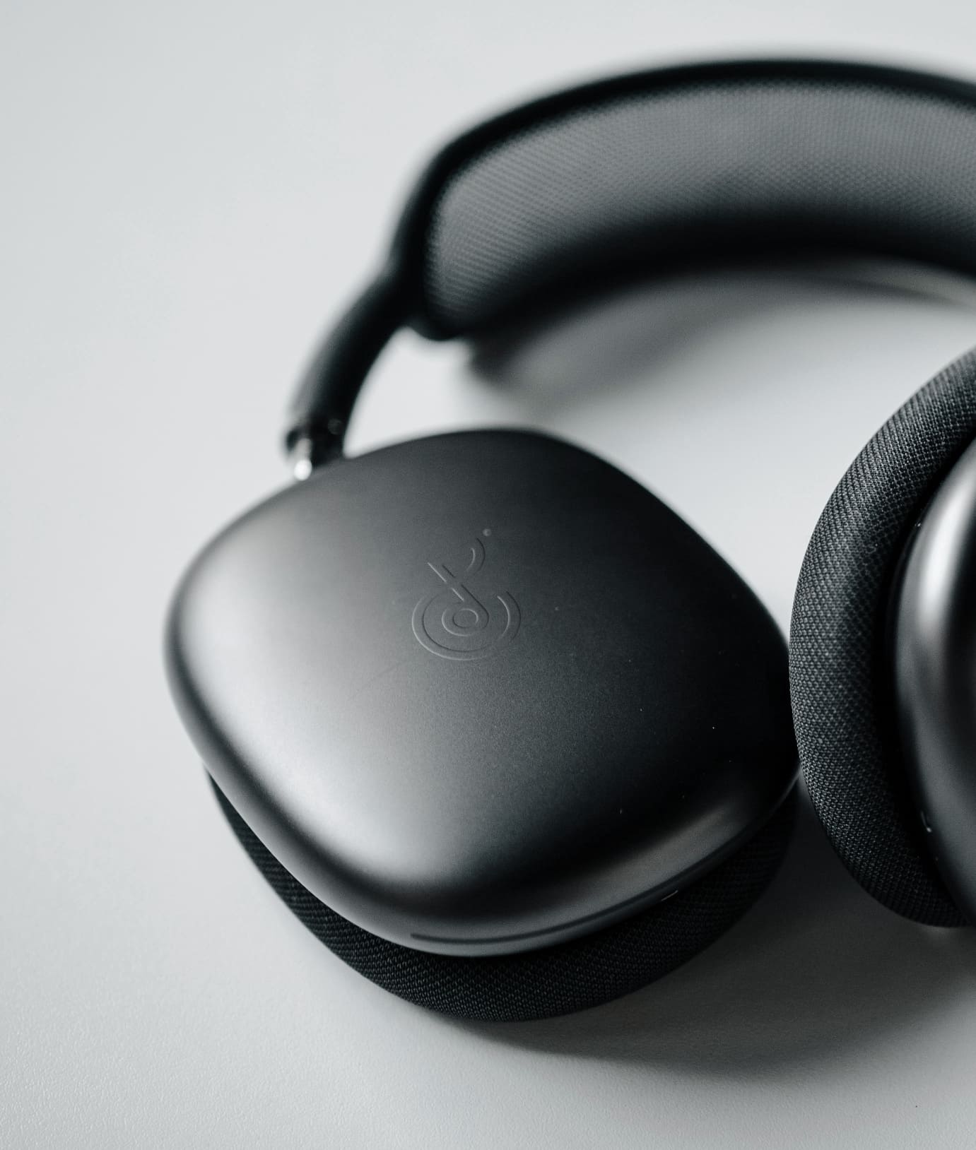
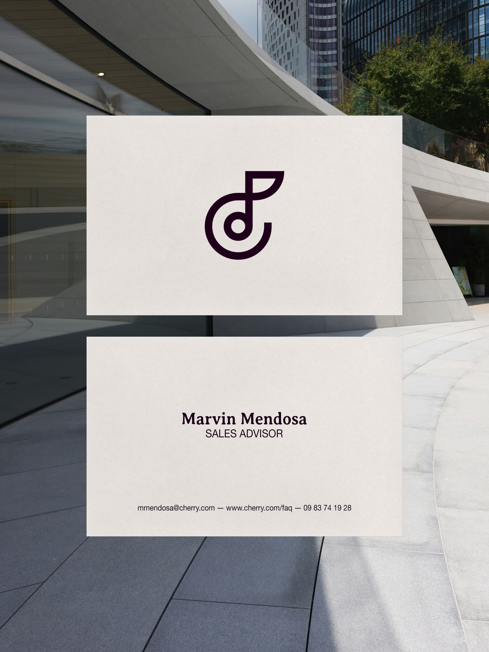
The logo combines a cherry and headphones, reflecting both the brand’s name and it’s business focus.

Advertising campaigns targets consumers directly, creating a sense of belonging to the ‘Cherry family’.
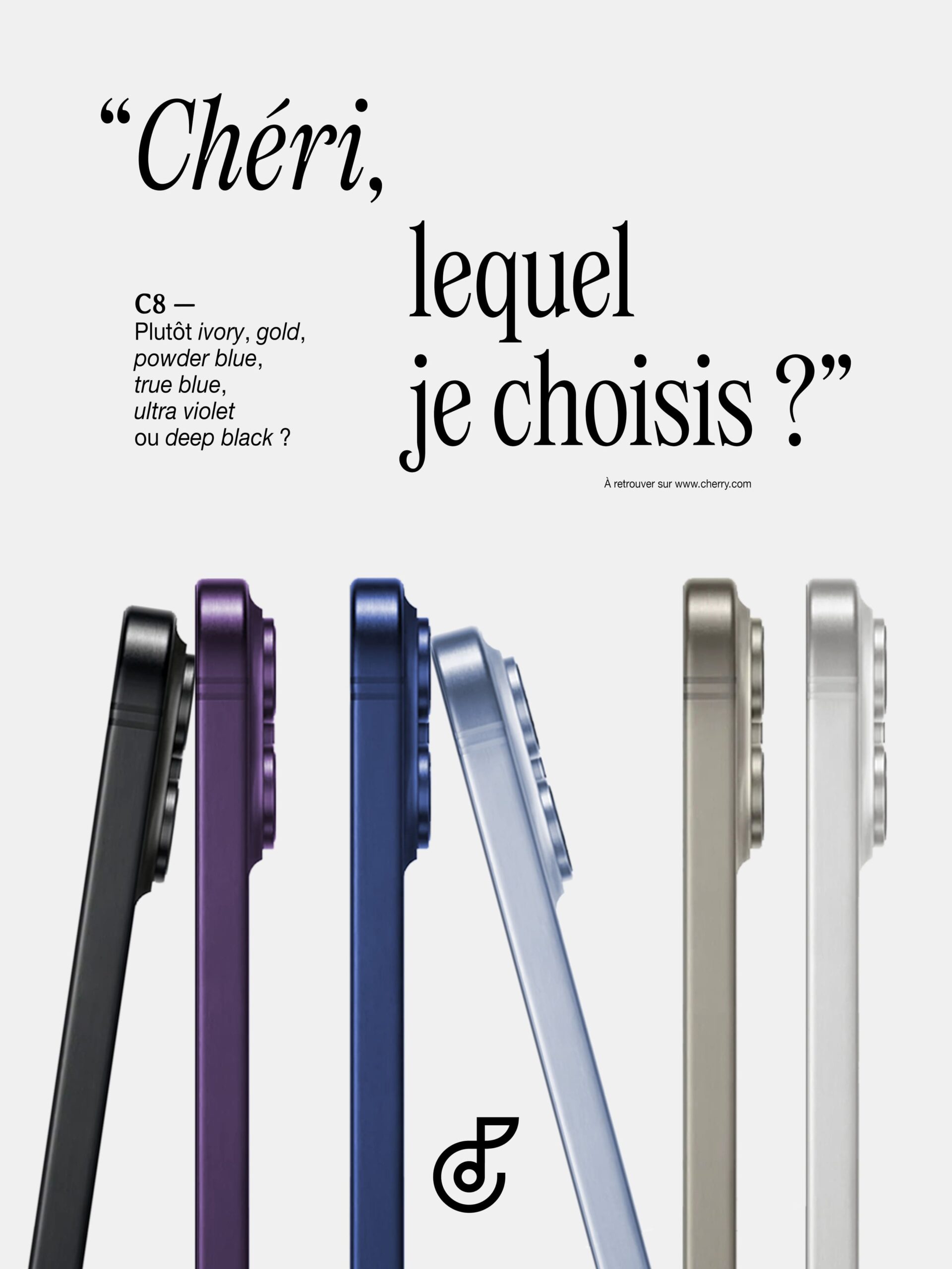
Poster explanation: ‘Honey, which one should I pick?’ The nickname ‘honey’ translates to ‘chéri’ in French, which is pronounced the same as ‘Cherry’.
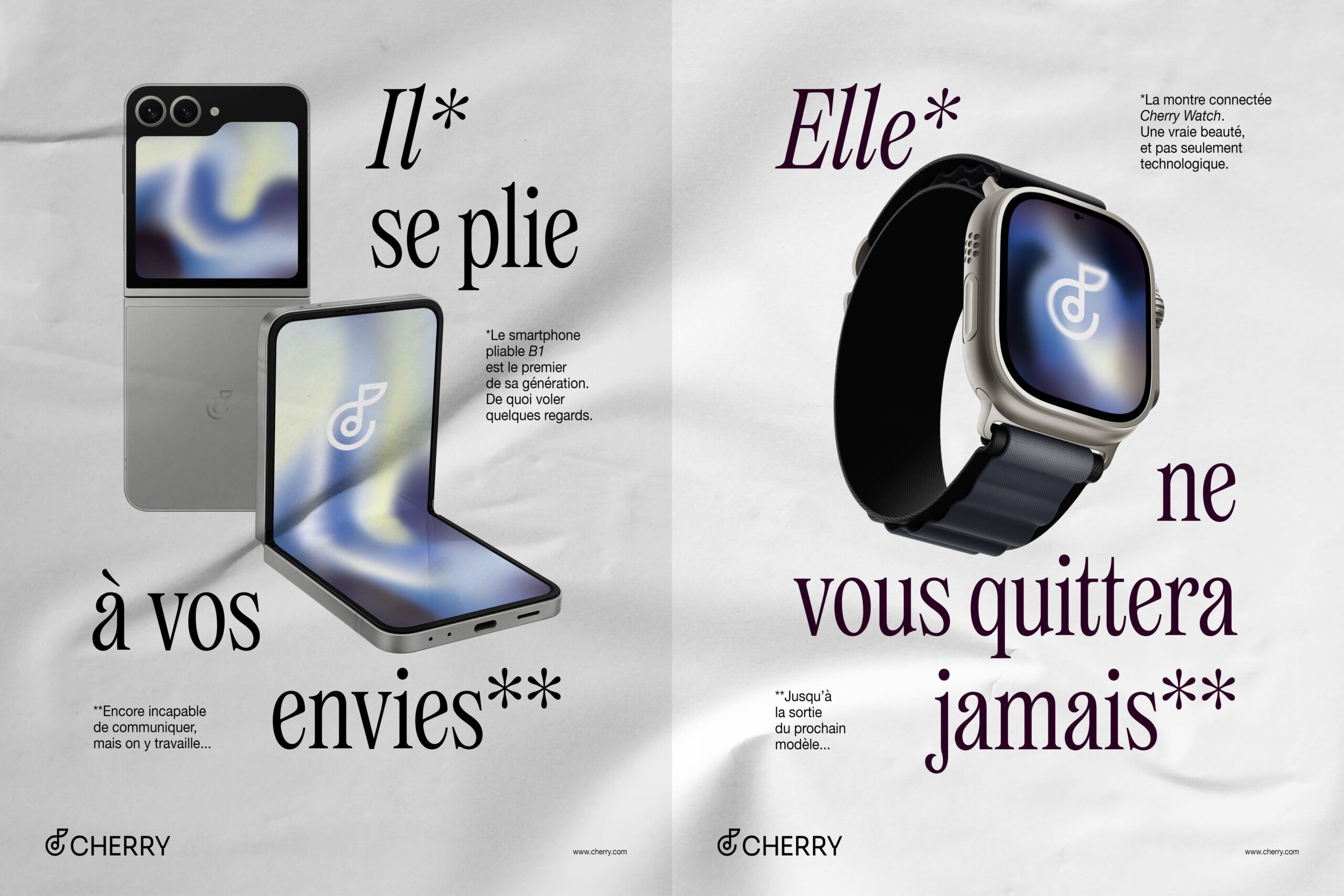
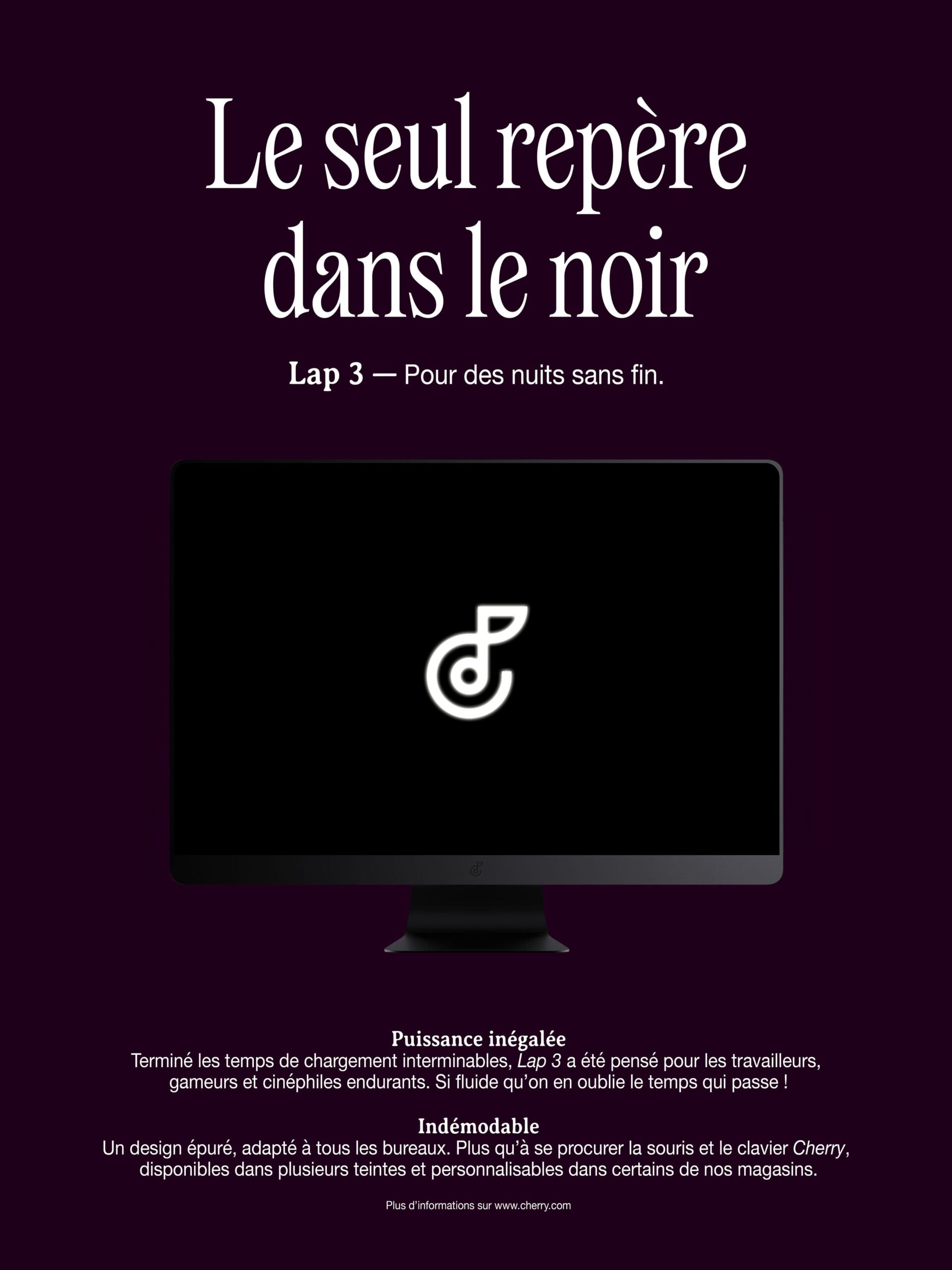
Poster explanation: in French, nouns are either feminine or masculine, and objects are assigned gendered pronouns—‘he’ or ‘she’—instead of ‘it.’ On the left side, ‘he bends to all your wishes’. On the right, ‘she will never leave you’. Below: ‘the only light in the dark, for endless nights’.

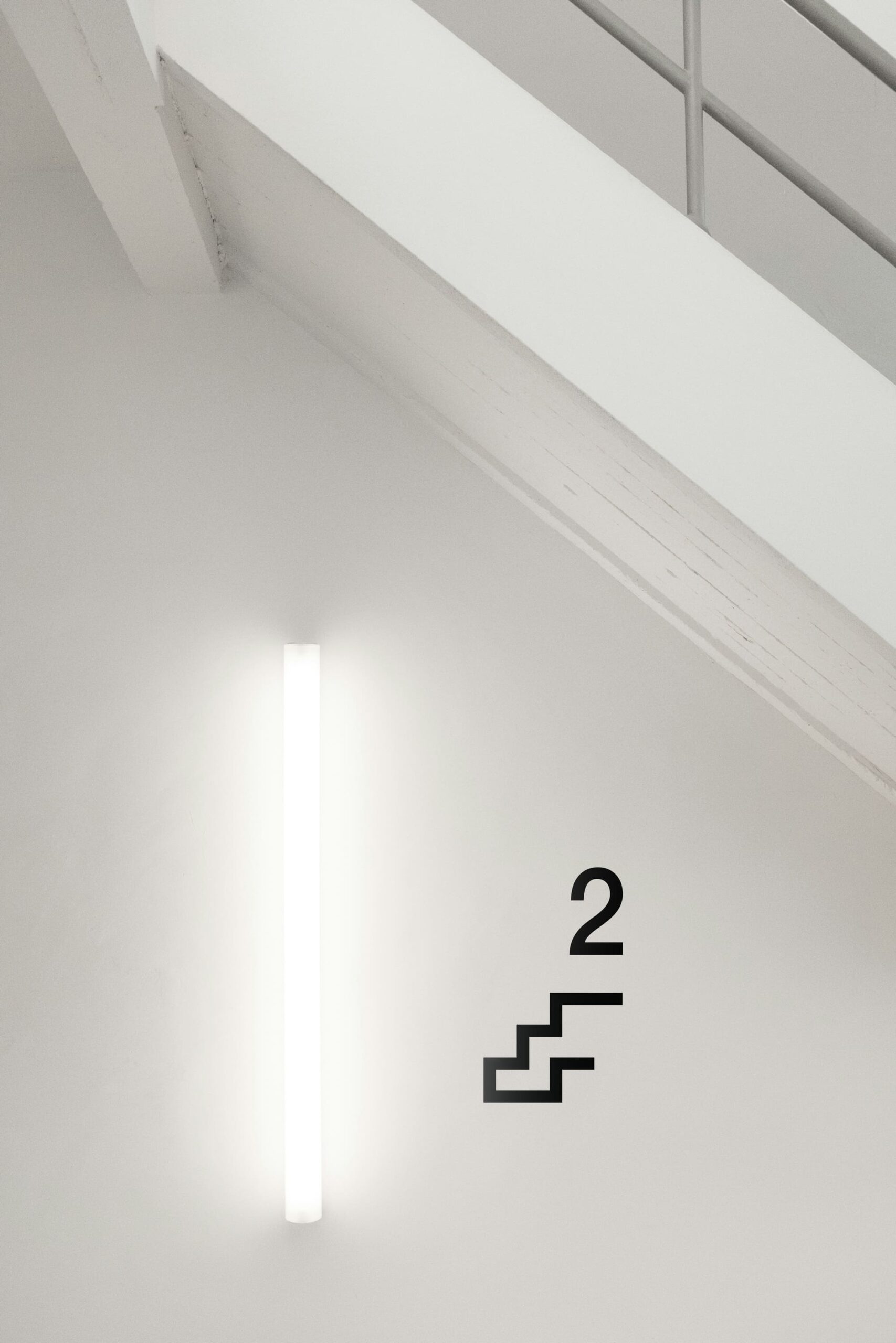
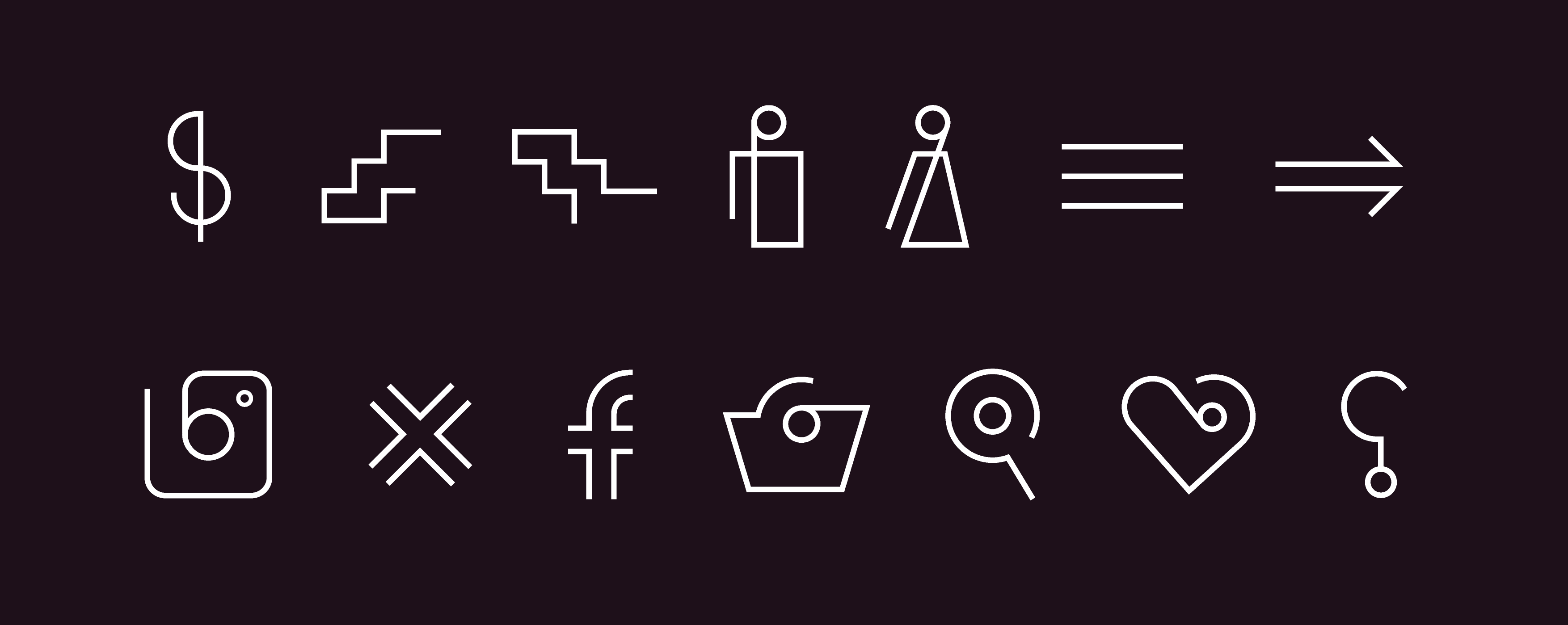
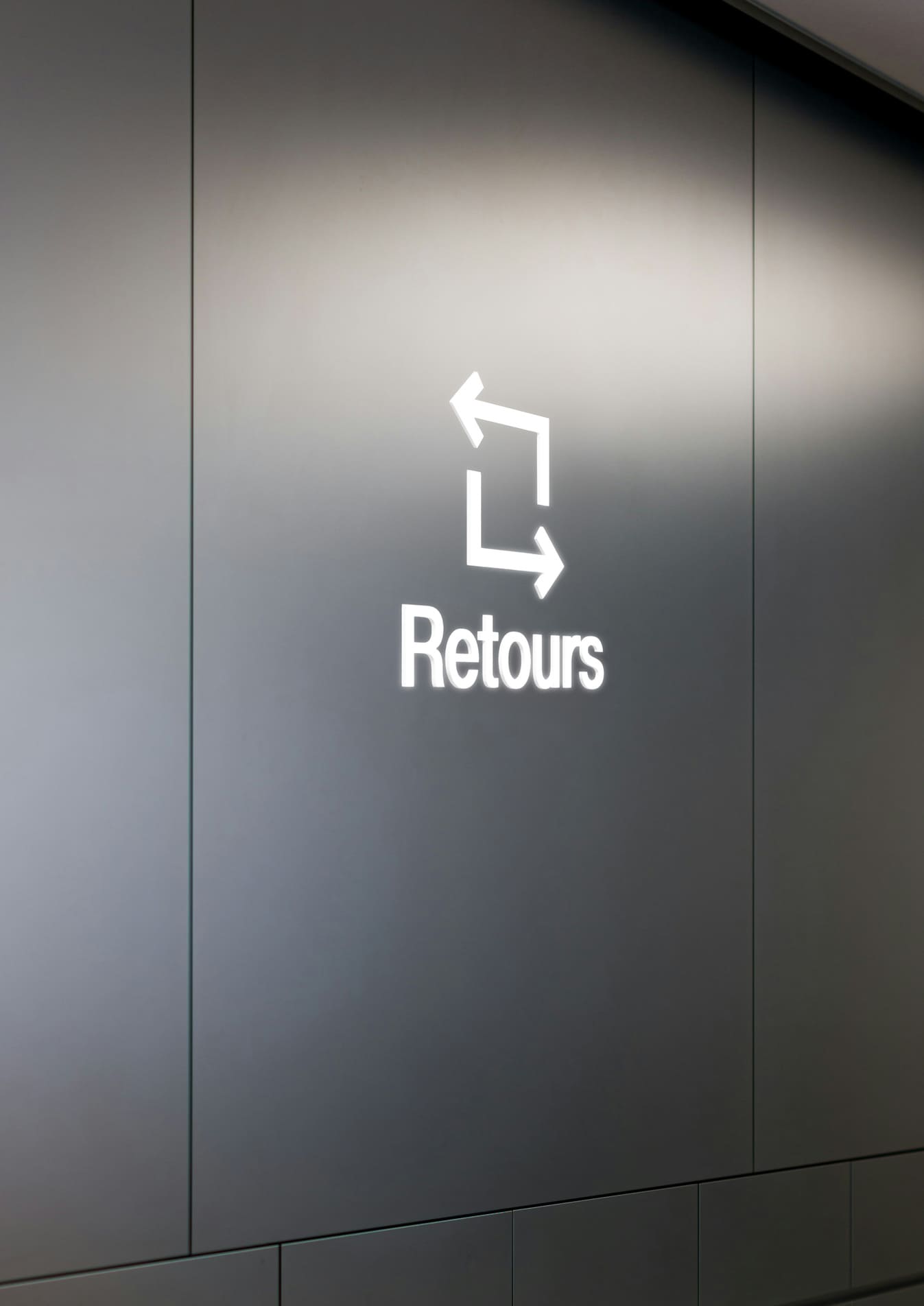
The symbol inspires the pictograms and signage used across the website and in-store.
