L’Écrin
BRANDING – UI – CONTENT CREATION
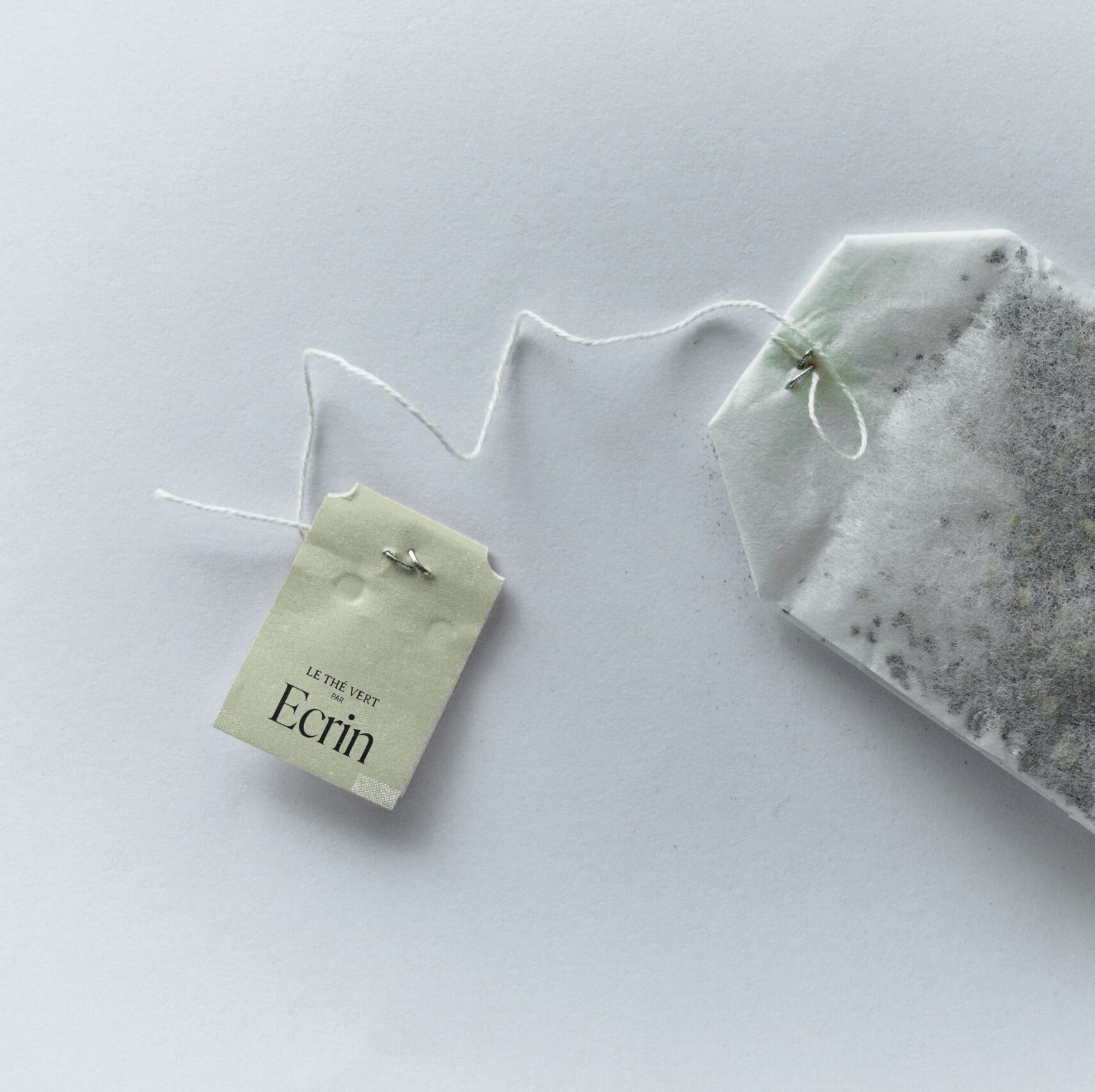
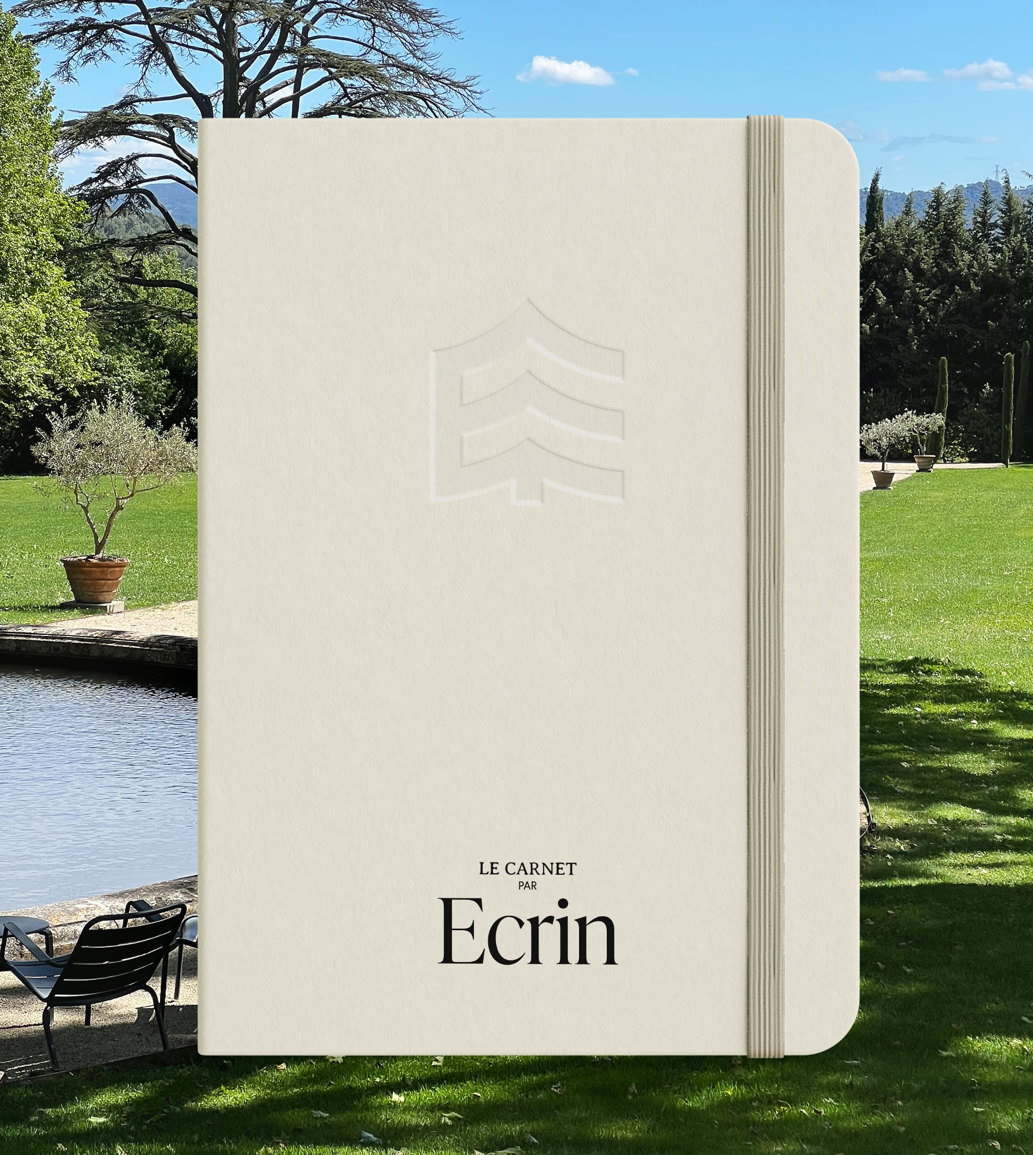
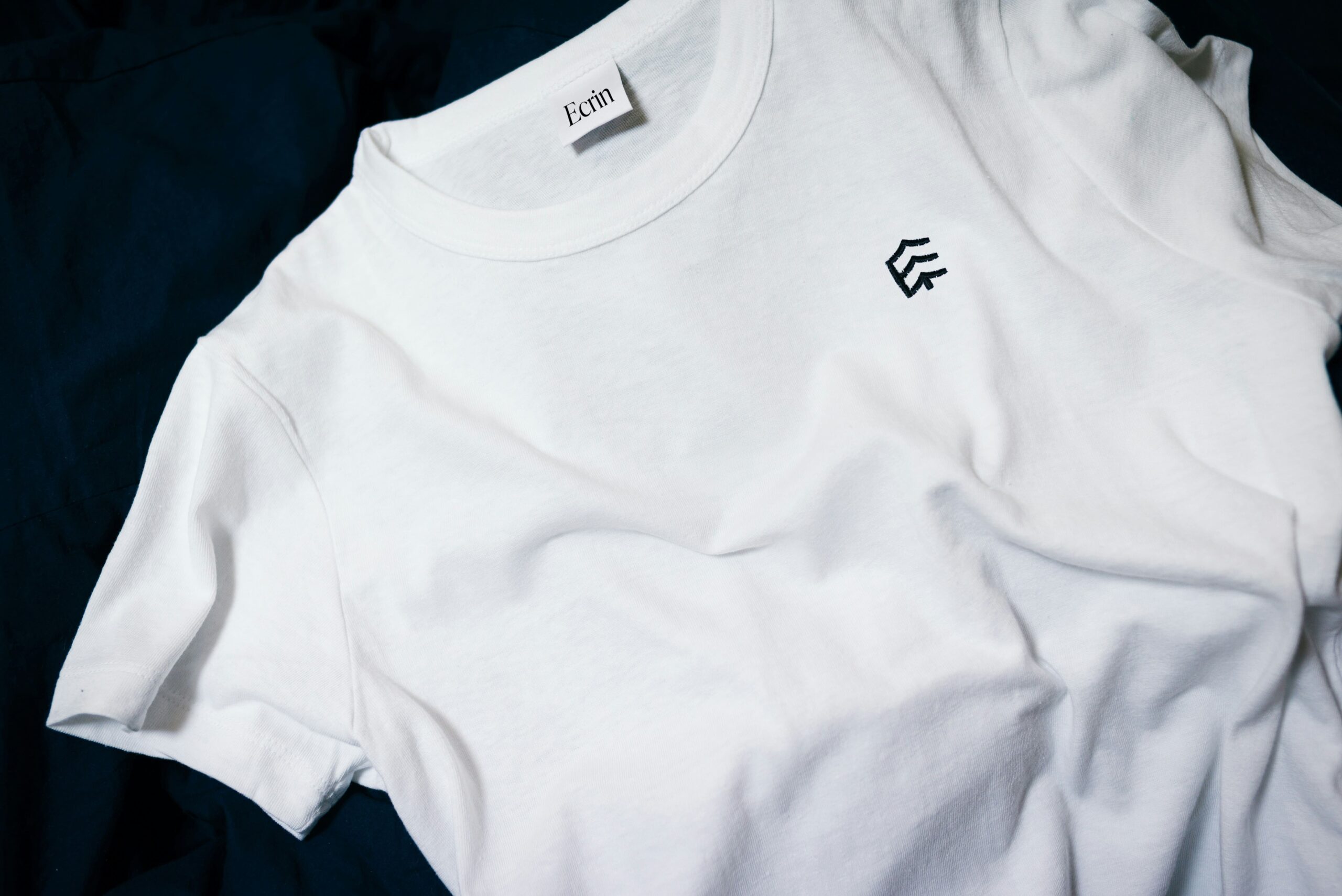
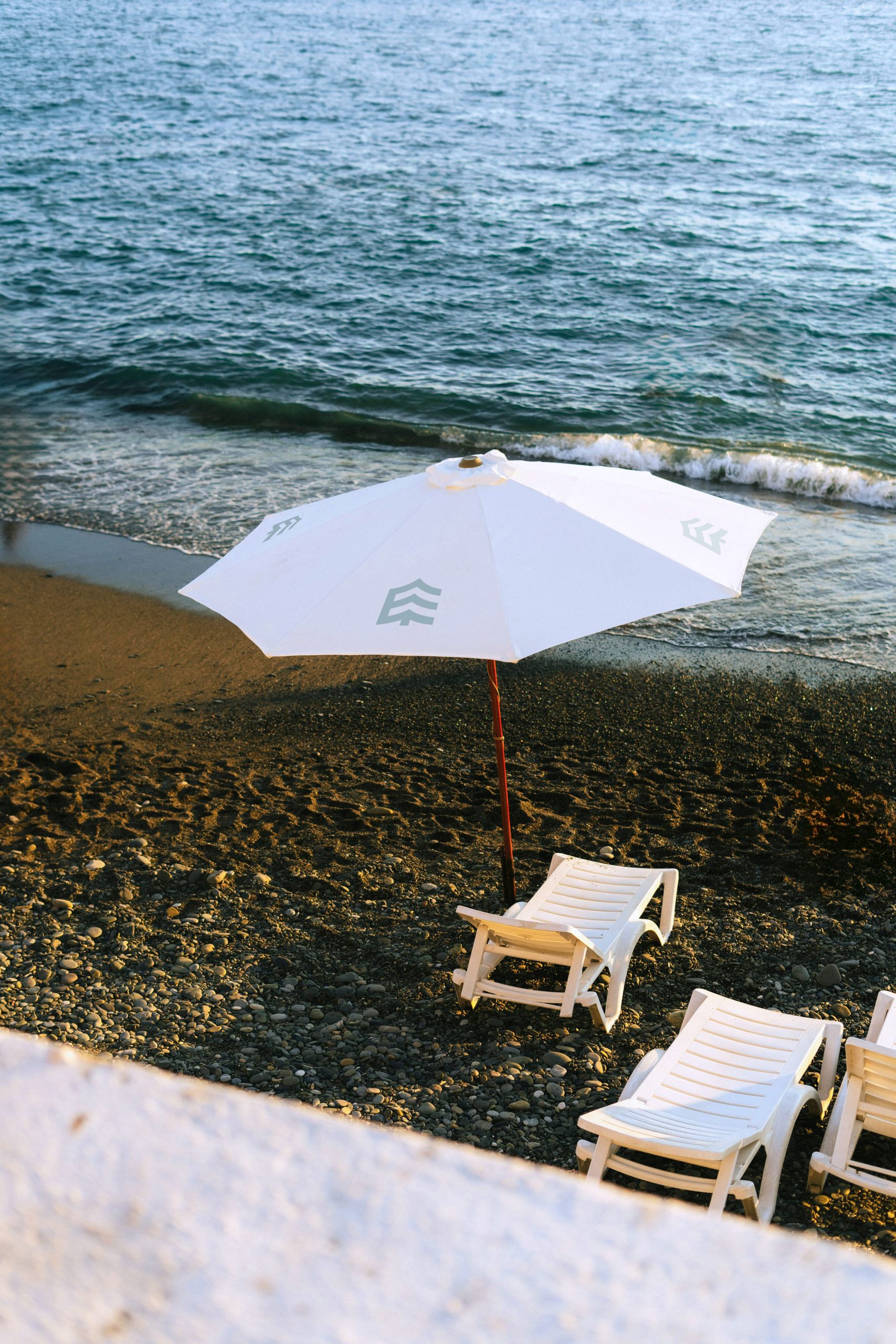
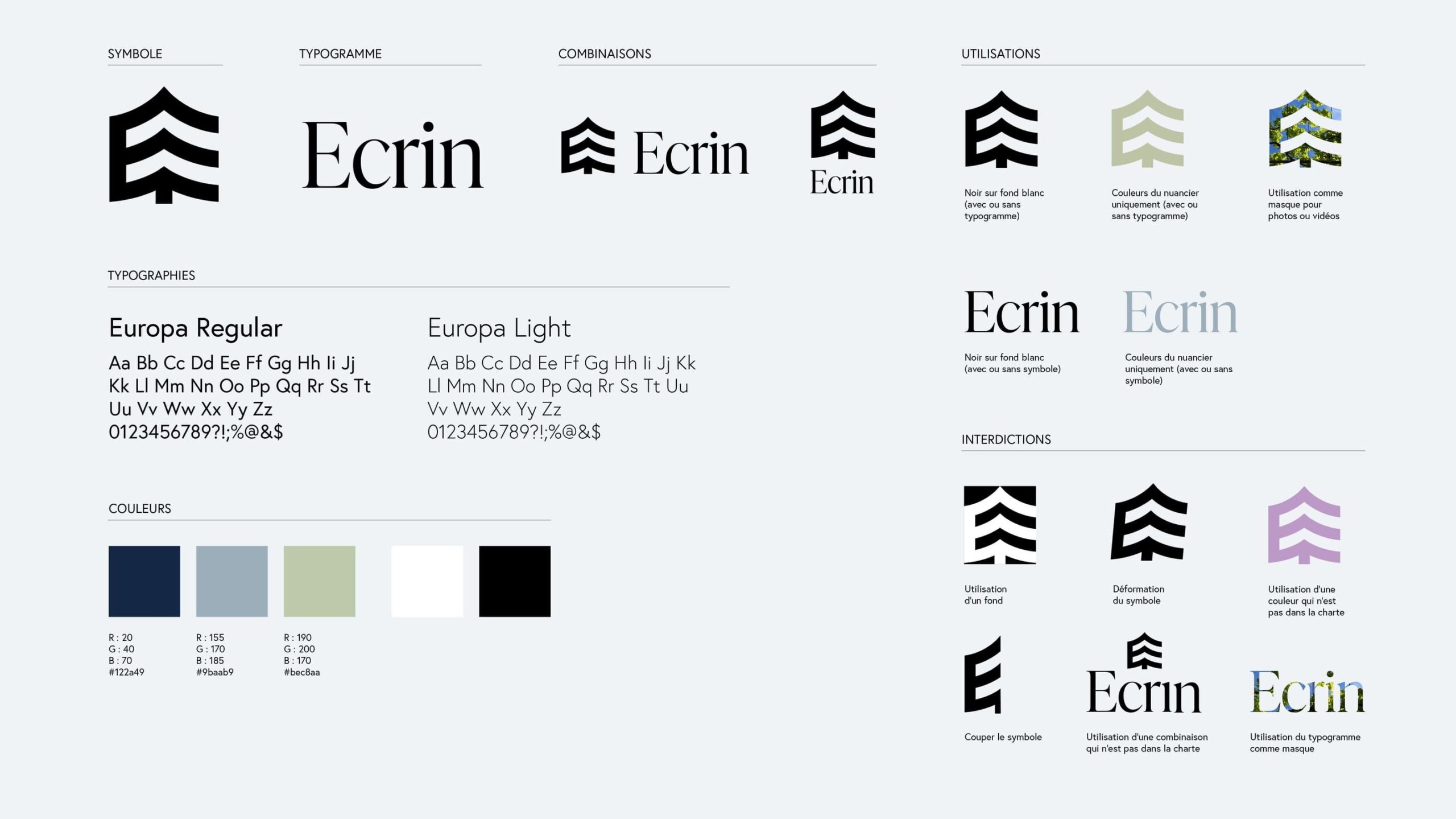
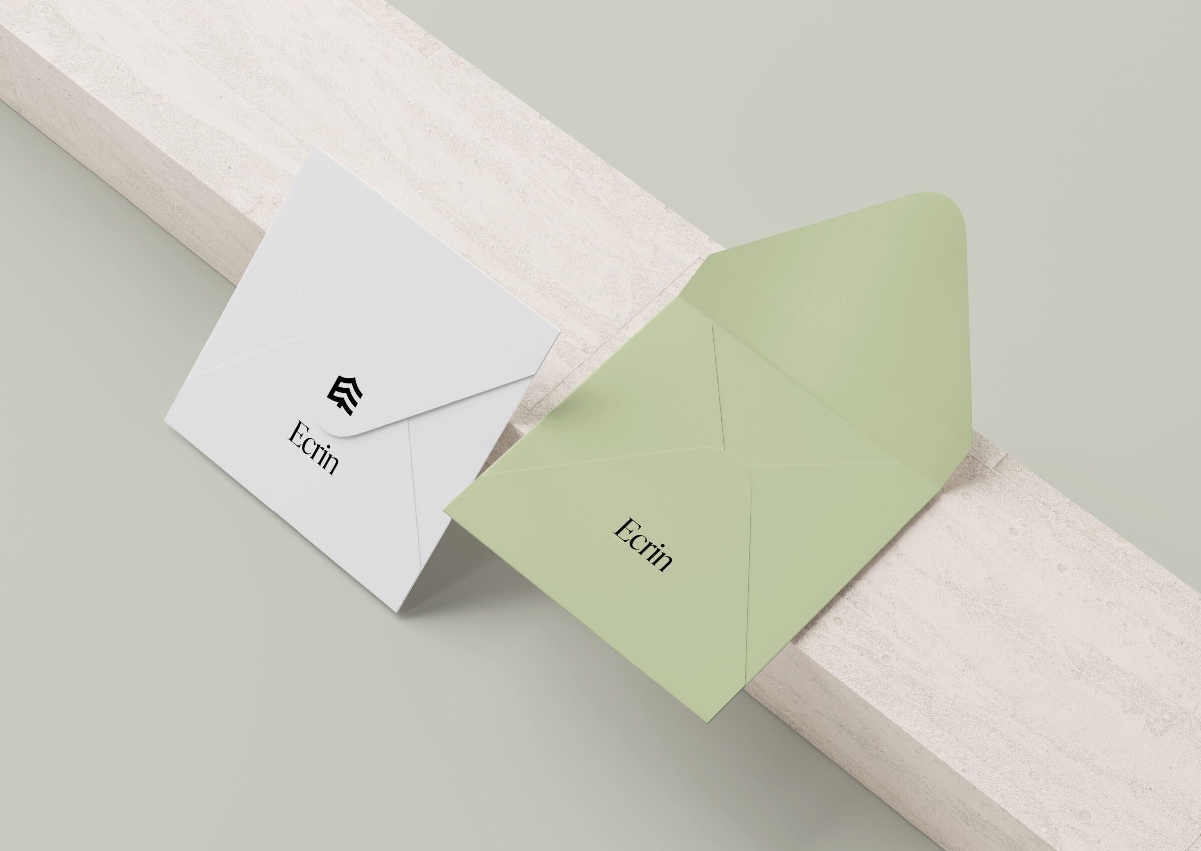
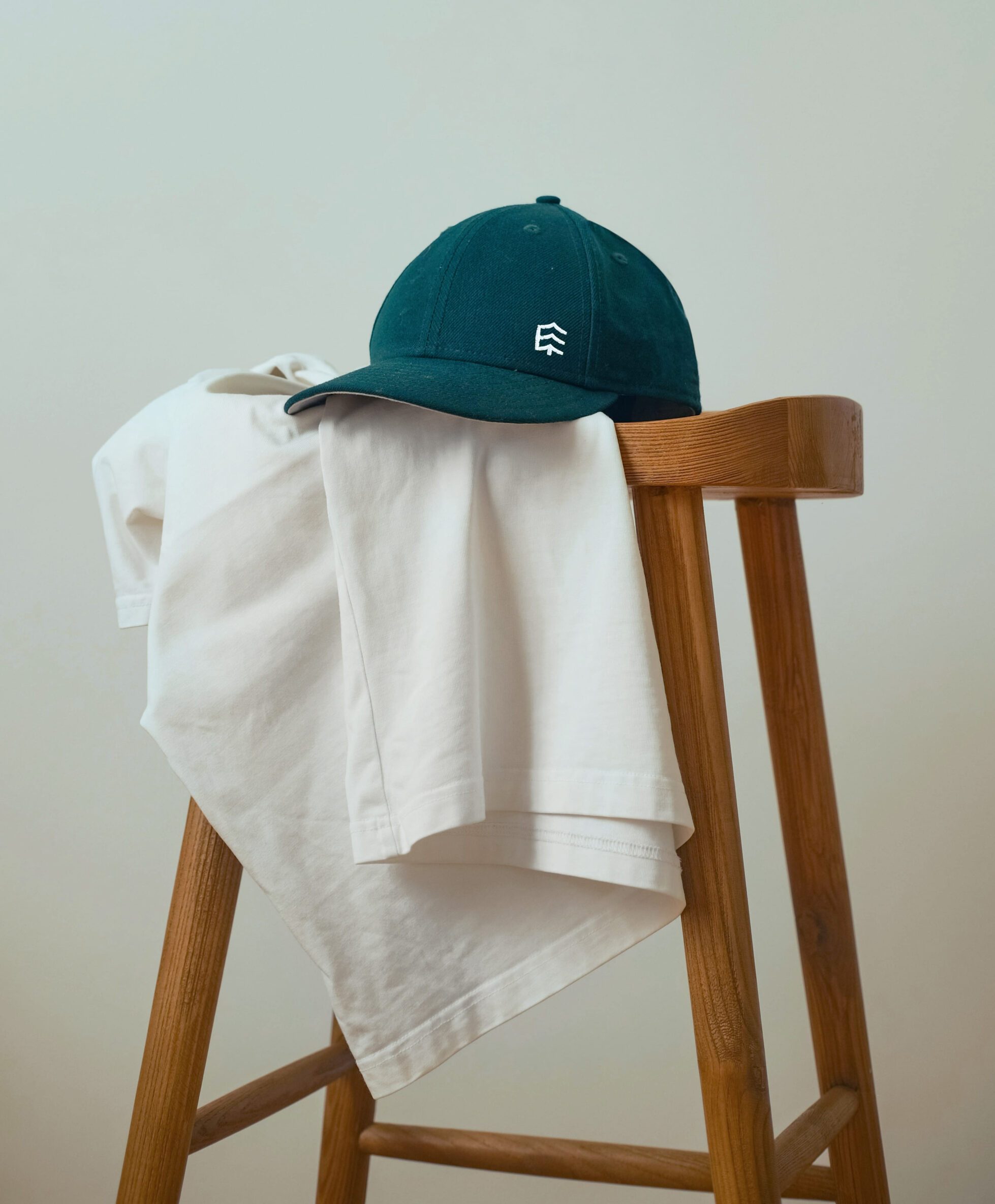
Creation of a visual identity for a high-end ecological accommodation project, offering inns and private homes worldwide while focusing on sustainability. The logo features a symbol combining the brand’s initial with a nod to nature, alongside a typogram.
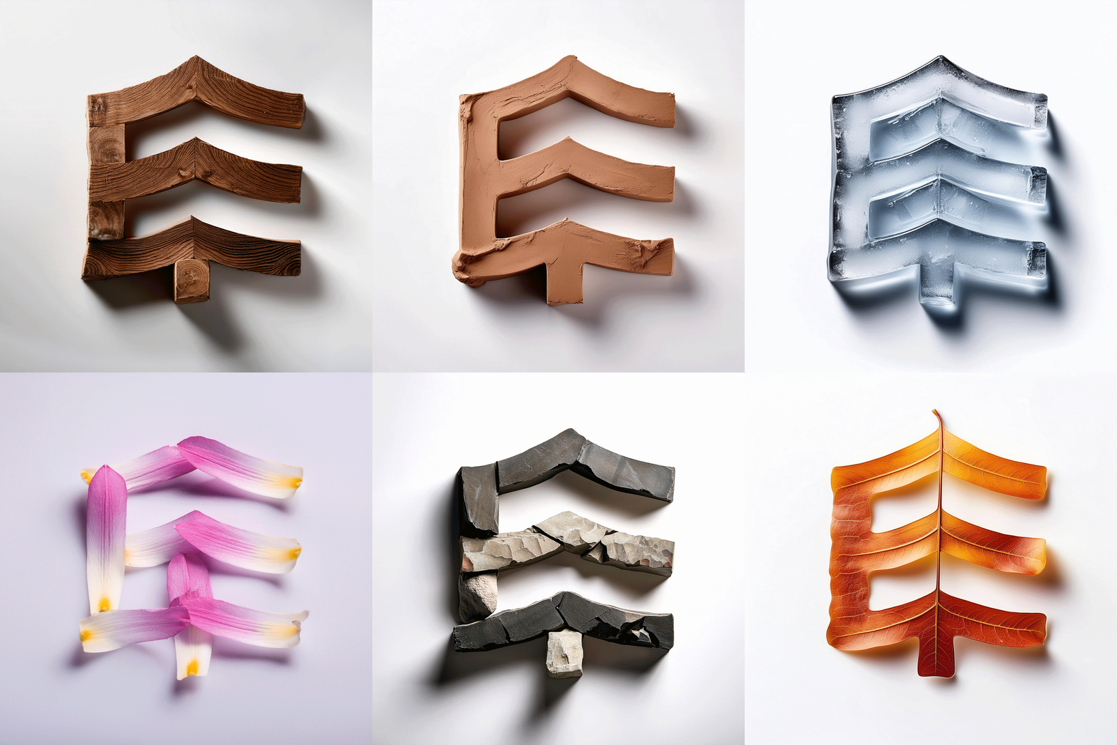
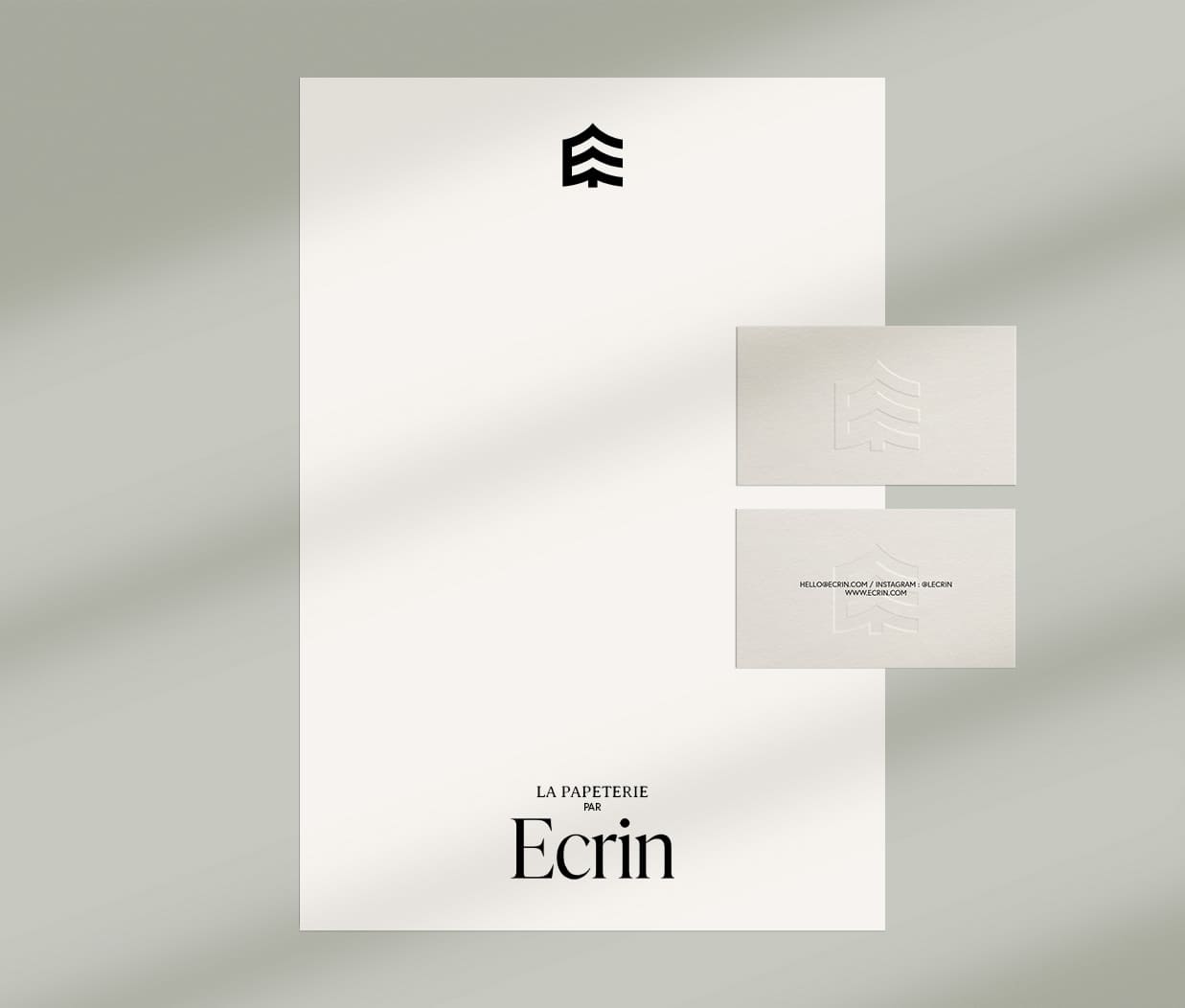
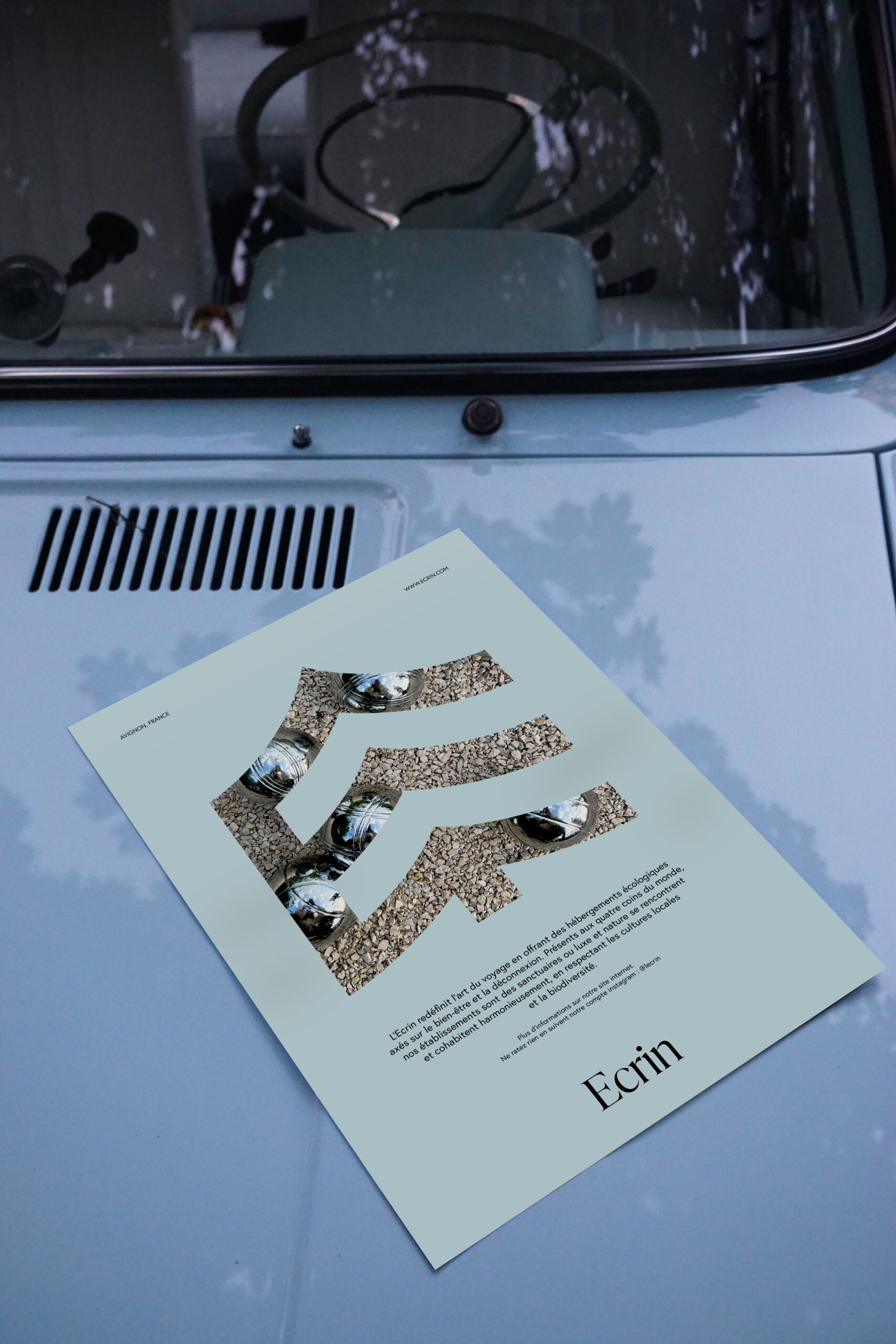
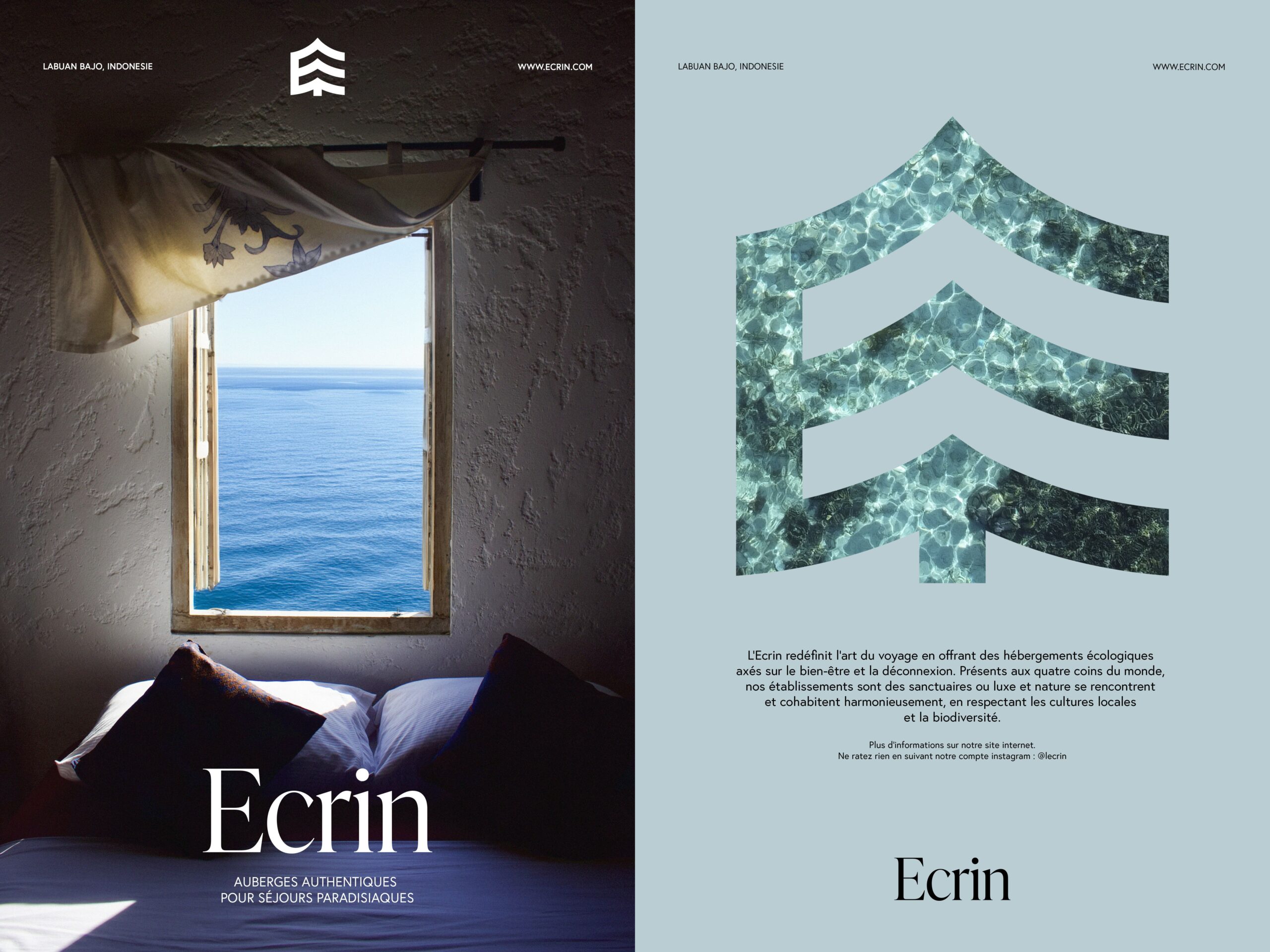
The visual identity is built around three core colors and the symbol itself. An ‘écrin’ in French is a sort of protective case usually used for precious goods. Photos and videos are integrated into the symbol, like a jewelry placed in an ‘écrin’, symbolizing the company’s commitment to protecting these places and the memories you’ll create there.
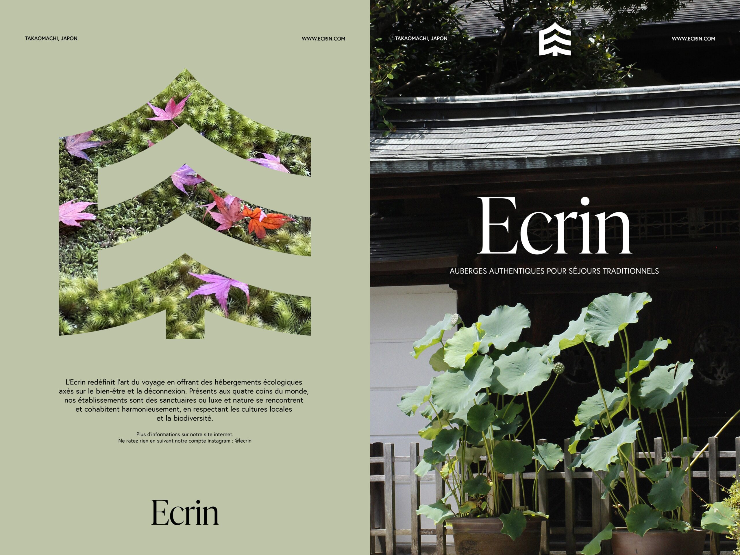
The baseline changes depending on the destination. Above: ‘authentic inns for traditional stays’, while below: ‘authentic inns for heavenly stays’.
(Poster translation: ‘Ecrin redefines the art of travel by offering eco-friendly accommodations centered on well-being and disconnection. With locations around the globe, our establishments are sanctuaries where luxury and nature coexist in harmony, all while respecting local cultures and biodiversity.’)
The website and Instagram focus on visuals to offer potential customers a glimpse of the destinations.
